Simplifying Tractor In-Cab Displays
Cutting cognitive load in John Deere's tractor interface so operators spend less time fighting menus and more time in the field.
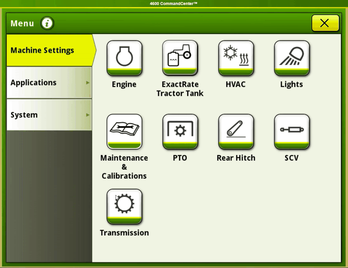
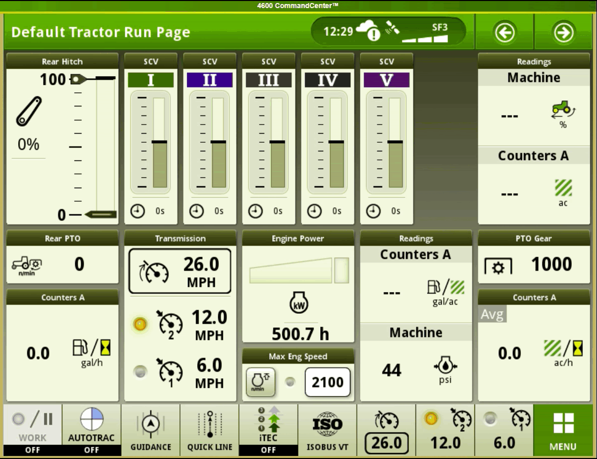
The Challenge
John Deere's in-cab displays were getting in the way during real farm work. The Layout Manager was barely being used. The Help Center wasn't answering the questions operators actually had, so they lost time and got frustrated trying to set things up.
Research Methodology
How we built the research
We started with John Deere's UX team to map the issues they were already tracking, then ran research with farmers at Iowa State University to confirm what was real and find what they'd missed.
Stakeholder Interviews
Met with the John Deere UX lead to map current system limitations and business constraints.
User Interviews
Ran 5 interviews with farmers across novice to expert experience levels.
Task Analysis
Walked through 3 core operator tasks to find the worst workflow bottlenecks.
Usability Testing
Tested current vs. proposed designs and measured the gap with NASA TLX and Likert scores.
Key Research Findings
Complex Customization
The 14-step flow to customize a homepage and set up widgets was painful enough that most operators gave up on personalization entirely.
Deep Navigation
"Run Pages" setup was buried behind deep menu layers, so even simple customization felt like work.
Safety Concerns
Deletion flows had no real warnings, so operators could lose configuration data with a single misplaced tap.
"The screen becomes almost unusable during sunny days when I'm working in the field. The brightness issue combined with the complex menus makes it really frustrating to use."
User Persona

Theo Thompson, 56
Farmer
An experienced farmer and technician with hands-on agricultural knowledge.
"Customization is huge... because when you're so used to it, you just realize that like this is how this doesn't work."
- Run planting and harvesting tasks from the tractor's display without fighting the UI
- See real-time data while monitoring ongoing operations
- An interface that fits the range of jobs he does in a season
- Get more done by managing and monitoring tasks in real-time
- Use time, labor and materials efficiently to keep costs down
- Make data-driven decisions that improve crop yield and quality
- Re-entering the same data every time he sets up a new equipment profile
- Having to retype implement details whenever he swaps gear
- Customizing the interface is harder than it should be
Wireframing
.png)
Design Solutions
Enhanced Help System
Swapped text-heavy documentation for a visual "Help Guide" and QR-code "Video Tutorials" that operators can pull up without leaving the task they're on.
Streamlined Run Page Creation
Cleaned up the dashboard setup flow with clearer buttons and contextual tips. Configuration dropped from 14 clicks to 8.
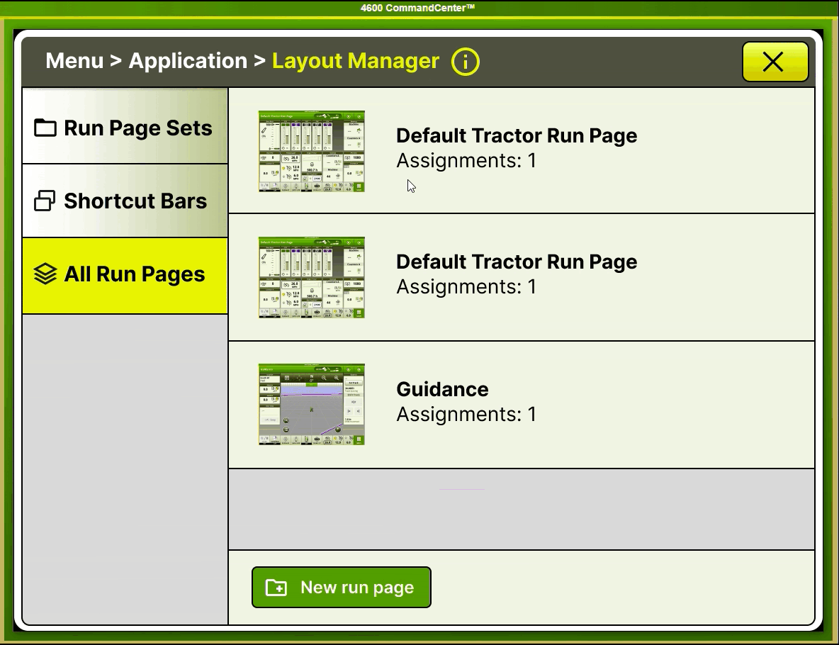
Intuitive Page Set Management
Added multi-select and direct controls like "Set as Active" so operators can organize page sets without re-learning the menu each time.
Usability Testing Results
Quantitative Validation Using NASA TLX
We tested the current interface against our proposed design using the NASA Task Load Index and Likert scales, so the improvement wasn't a vibe check.
Impact & Business Value
The redesign backed up our hypothesis that simpler menus and a better help system would make operators more efficient. The metrics that matter for day-to-day farm work moved in the right direction.
Key Business Outcomes
- 41% decrease in mental demand, which lowers operator fatigue on long shifts
- Stronger safety protocols from clearer deletion warnings and confirmation flows
- Faster onboarding using visual help guides instead of static documentation
Design System Principles Established
Progressive Disclosure
Complex functions sit behind simple, contextual entry points so operators only see what they need.
Visual Hierarchy
Information architecture, spacing, and typography stay consistent so the screen is scannable at a glance.
Contextual Help
Help comes through QR codes and visual guides at the moment it's needed, not buried in a manual.
Key Learnings
- Industrial UX is about balancing feature depth with operational simplicity
- Environmental factors like sunlight and vibration change what "usable" actually means in the cab
- Standardized metrics like NASA TLX give design decisions evidence stakeholders trust
- Working closely with engineering kept the solutions feasible inside Deere's existing system